Competitor review
We’ve looked at lots of other websites in the field of international/national competitions, and other events as well as a few beyond to find interesting and exciting stuff. Suggestions have come from the website survey, interviews, conversations and a blog post.
Here are some of the things we’ve found. These ideas and approaches will inform the design stage of the WSAD2017 Alpha.
Long scrolling stories
These types of stories have become a staple of late. If done correctly they work well on smaller screens and take advantage of the idea that scrolling is a continuation but clicking is a decision. Use beautiful images, infographics, short Vine-like videos or gifs to tell a story. Use movement and animation to describe the steps of a process or show moments of action or excitement. Include instructions and opportunities to encourage users to share the story.
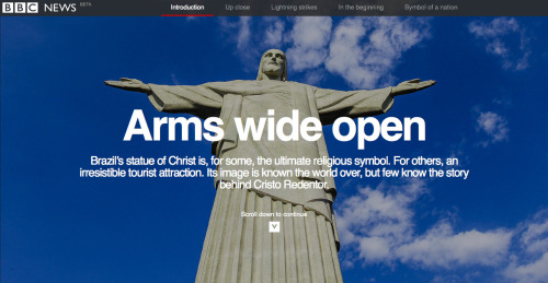
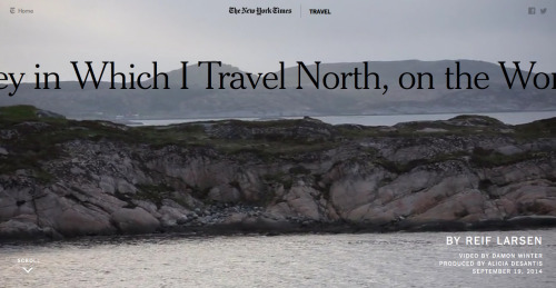
In these long stories we could pick out tweetable text snippets to encourage users to share the story like this example by The New York Times.

See this list for more examples.
Personalisation
Personalised storytelling uses data to adapt content to the user. It could be self-selected using a dropdown or questions or it could be automatic using location or information from a user’s social profile.
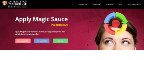
The University of Cambridge have developed a a service which takes a user’s Facebook profile and creates personality traits. We could use this approach to suggest possible skills to users.
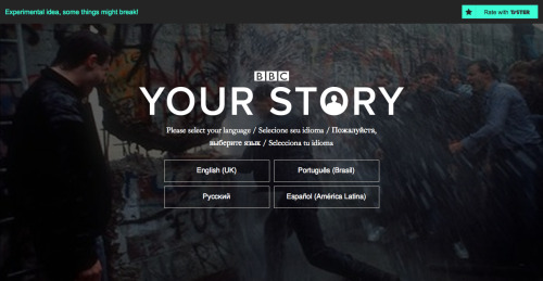
Your Story creates a personalised story of your life using your Facebook data.
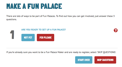
Fun Palace uses a quick and intuitive way to get people involved.

Natural language forms, like this one on betterment.com, also offer a good way to get users to personalise content. For more information see this blog post on natural language forms as a user interface.
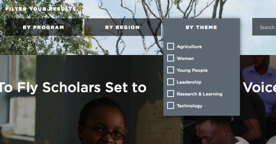
The Mastercard Foundation is built around a set of filters which update the content below.
Big numbers / facts and figures
Facts and figures are good for journalists. The big figures provide a good focus for the layout and links to more information.

World Cup 2014
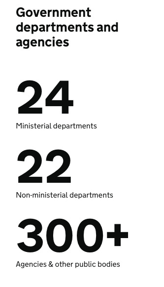
gov.uk
Real-time updates and social feeds
Pulling in updates from social networks around hashtags can provide fresh and interesting content. We’re not convinced about how useful it is as it does rely on unedited stuff from other social media profiles.
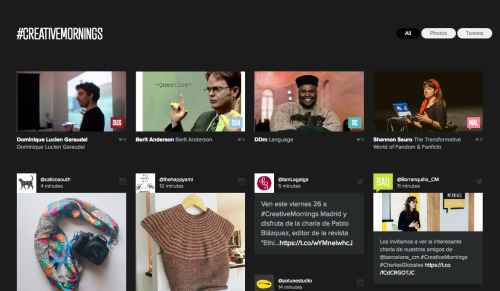
Creative Mornings pulls in posts from Twitter and Instagram around the hashtag #creativemornings.
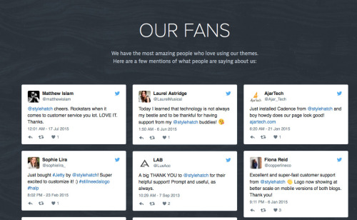
Style Hatch use social proof and testimonials to let users speak for themselves.
A new service called https://seenit.io/ helps organisations harness the power of superfans - groups of dedicated people making video responses quickly. Creating videos in this way is a good example of how to develop a community of fans and keep them engaged.
As well as pulling in, we need to push out. Real-time notifications are starting to become available in the browser using a technology called services workers. We can achieve much of what an app does by using this technology.
If we did create an app, a conversational interface as used in the new Quartz app could be an interesting approach.
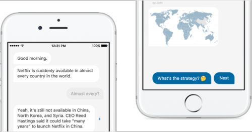
Similarly Twitter bots can be used to automatically direct users to content associated with particular keywords, such as this example by Feeltrain.
Timelines
Timelines are an important tool to provide clarity, context and depth. They are also a great way to bring together text, images and video. We will consider the importance of having a tool to build custom timelines.
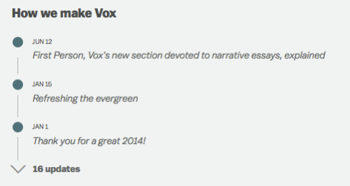
Vox
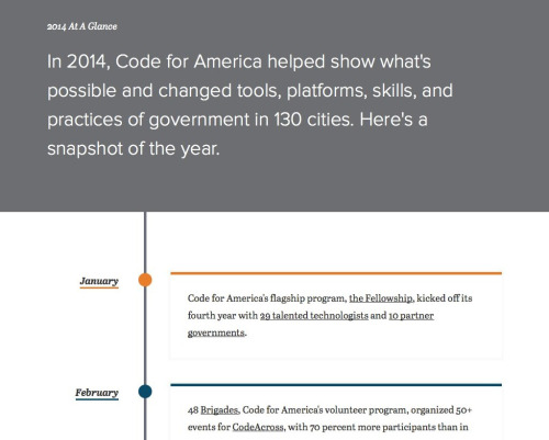
Code for America
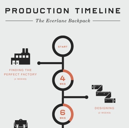
Everlane
The “papernet”
Paper “remains the most succesful and robust architecture of shared histories to date.” What happens when we try to imbue a pamphlet or a printed map with some of the qualities associated with the internet? Take Twitter posts, Instagram images and other social media from the event and create a daily map, which becomes “both service and souvenir.”
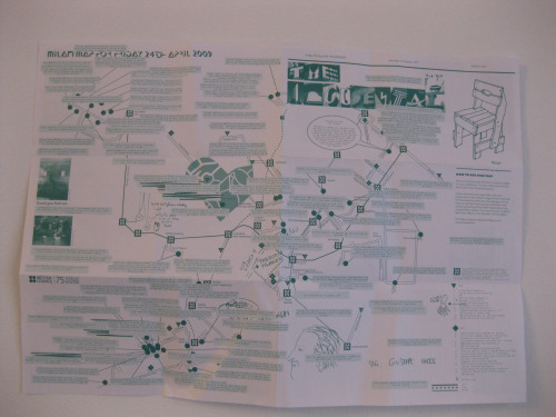
“This rapidly-produced thing then becomes a ’social object’: creating conversations, collecting scribbles, instigating adventures – which then get collected and redistributed.” - Matt Jones
Augmented reality and interactive video
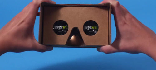
360 videos are a new form that puts viewer at the heart. While VR headsets are not widely in use yet, it’s quite popular at the moment to have a cardboard headset with a mobile app.
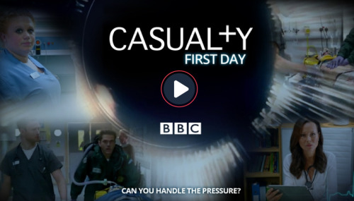
Interactive videos make the user responsible for the outcomes. As such they can heighten engagement and have considerable emotional impact though it’s good to concentrate on a few, positive decisions. This example put the viewer in the role of a junior doctor on their first day.
Gifs and short videos
Using video as a background to the top of a layout can be effective at influencing a user’s mood and how they feel about the site though it must be done responsibly so as not to hinder performance or create a poor experience on smaller devices.
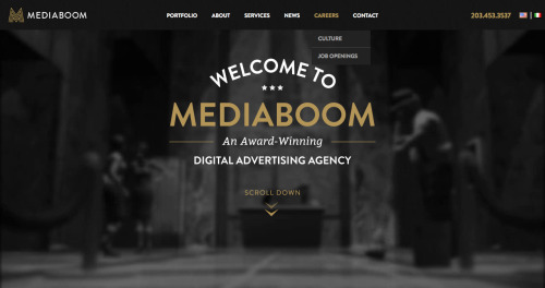
Mediaboom
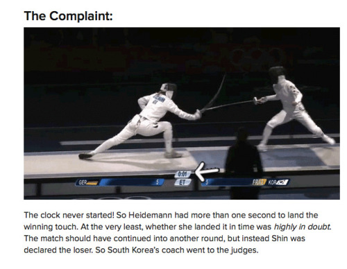
Short videos also work to convey action and provide interest. They can be entertaining and shareable. This example from Buzzfeed tells a story and conveys the drama of what happened during an Olympic fencing match.
They also work well in email and social media like this “datablast” from DWP.It’s not animated but it might be worth using an open-source tool such as Cardkit to standardise images for social media.
Other sites
We also looked at lots of other sites for inspiration about navigation, information architecture and other ways of doing things.
- http://www.baku2015.com/
- http://www.rio2016.com/en
- http://www.fifa.com/worldcup/archive/brazil2014/
- https://www.digitalconcerthall.com/en/live
- http://www.redbull.com/en/browse-all-events#3/16.80/9.05
- http://www.sxsw.com/
- http://www.thenec.co.uk/
- http://excel.london/organiser
- https://www.wise-qatar.org/education-summit-doha
- http://gamesforchange.org/festival/
- http://www.instituteofplay.org/work/
Thanks for all your suggestions.
