Visual design - Style tiles
Style tiles are boards that summarise the creative direction of the project. Starting with the existing brand guidelines for WorldSkills Abu Dhabi 2017, we’ve maintained some of the key brand elements while giving them a fresh, youthful twist.
Colour
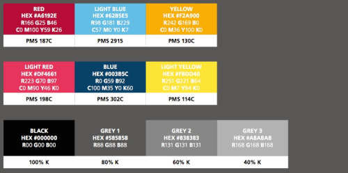
Here’s the existing WorldSkills Abu Dhabi 2017 palette.
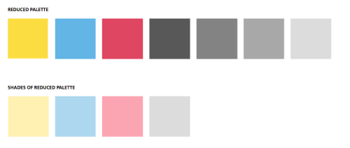
We suggest reducing the colour palette to the “brights” and greys. Shades of reduced palette are introduced to give further versatility as backgrounds, etc.
Typography
We wanted to embrace the modern sensibility of Frutiger by pairing it with the brand colours. Experiments with “highlighted” type have a subtle nod to textbooks and an educational look. We’re aiming for friendly and youthful and propose dark grey as the main text colour to give the words a softer feel and recede slightly next to the bold graphics.

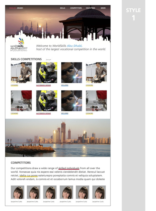
Style tile 1
Style one is polished and modern. It incorporates the Abu Dhabi skyline as a silhouette and has simple content blocks. Underlined text for links within copy is reminiscent of texbook highlighter. Overall this approach has a familiar, youthful spirit.
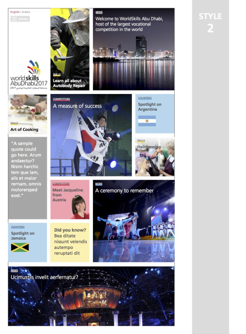
Style tile 2
Style two has a bold grid with colour-coded content sections. For example putting the countries in blue. It feels newsy and fresh. Colour-coding is mantainted in each block either with category highlight or box colour. Some spots could be used for interesting quotations, statistics or fun facts while the large squares could be for videos.
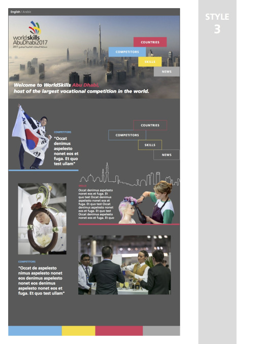
Style 3
Style three is a polished, contemporary design with a narrative feel.
These style tiles are not the finished designs nor are they necessarily the layouts we will be using on the final website. Rather the goal is for us all to think about aesthetic preferences and provide feedback or comments to help us develop the design direction and to hone the site’s visual language. We look forward to hearing what you think.