Visual design direction - Alpha round up
The alpha phase is coming to an end. We’ve built an alpha version of the site for the most important user needs, developed the visual design language based on WorldSkills Abu Dhabi 2017’s branding guidelines and created content for exemplar areas such as specific skills.
The visual design direction has always been about maintaining key brand elements while giving them a fresh, youthful twist. Here’s the latest visual design direction using the Frutiger font and a palette chosen from the brand colours. At this stage, these are still a device to explore design direction rather than fixed final designs. Once we’ve received and processed all the feedback from the alpha, we will use it to inform our work at the start the beta.
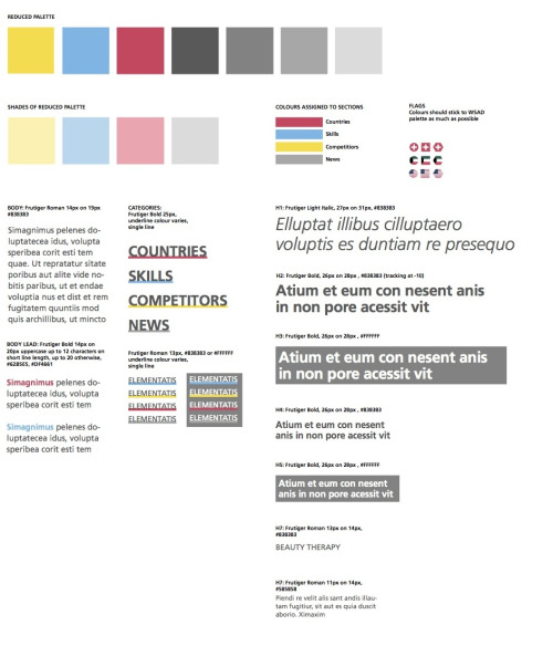
There’s lots of interesting stuff we’ve been exploring here: from the possibility of assigning colours to sections to the use of Frutiger in a dark grey to give great imagery a chance to shine. Incidentally, we ended up with the text using the hex colour #585858 which has a luminosity contrast ratio of 7.11:1 and so complies with Level AAA accessibility standards (which require a contrast ratio of 7:1 for normal text and 4.5:1 for large text).
The latest style tiles capture how these palette and typography choices could be used in the context of the homepage.
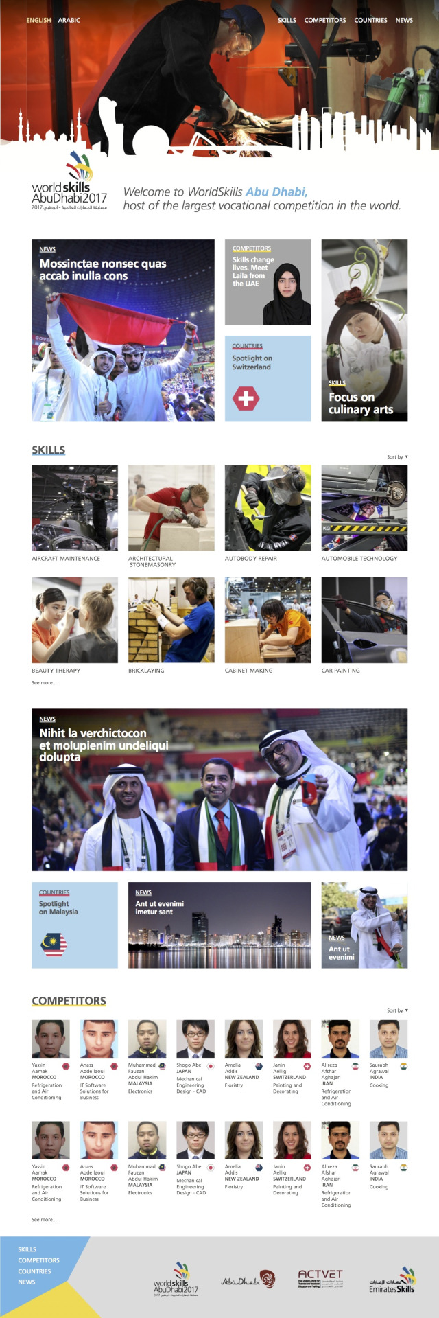
The skyline gives a powerful sense of place. Though image selection isn’t what we’re concentrating on at this stage, we need to use skills images which are inspiring. Our approach - though it’s not captured in this style tile - is device agnostic which means we are considering approaches that work on screens that range from a tiny phone to a widescreen TV. Overall, we’ve been working on a look which is youthful, clean and modern and we look forward to your feedback about the directions we’ve been pursuing so we can incorporate them in the beta stage.