Visual design development during the beta
We reviewed all the alpha feedback at the start of the beta. The visual design direction received a lot of important comments.
- Disparity between the bold brand colour scheme and the toned-down palette we developed during the alpha.
- The angular ‘cube’ device was missing, mostly because this branding was developed for print, but was problematic when producing work for screens.
- With the flags, it was important to maintain the ratio and colours of the flag as specified by the country/region.
- The skyline line art clashed with the brand.
We worked to resolve these issues by introducing more brand-heavy stuff in elements such as the header, graphical overlays on imagery, etc, while working to maintain the clean and youthful direction developed during the alpha.
We tried out diagonal background shapes that feed between sections to help a sense of flow, but also add excitment.
We went with bolder use of type in the top section and separated the skyline out, making it smaller without reducing its impact.
Everything got a little heavy, so we moved back a bit, keeping the impactful header, but with a lighter touch on the rest of the page elements.
Here’s a few snapshots in this process:
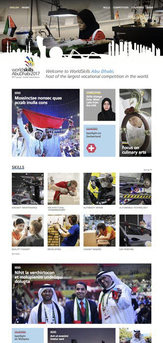
We redesigned the page headers so that they are now more visually rich, using photography of Abu Dhabi to give a greater sense of place, whilst using the WS brand colours. The graphic that houses the logo changes colour depending on the current section the user is in. The navigation links were also better integrated into the overall design.
We also explored using tools on the inner headers trying to find an approach that allowed us to use the strong graphic device of the tool silhouettes, but still use photography as specified by the brand guidelines.
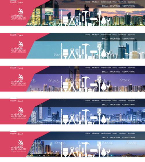
That didn’t go down well, so we came up with the following approach:
For all the pages that sit behind links in the top row of the navigation (Your Hosts, News, Get involved, etc), we use a purely photographic header. Skylines, shots of the mosque, etc.
For all sections that are specifically competition-focused (Skills, Countries, Competitors), we use the tool silhouettes, on a flat coloured background (drawn from the brand colour palette). This is a good visual distinction between site content which is specifically about Abu Dhabi, and content which is about the competition.
That approach didn’t work either, so we’ve ended up with photography on all headers.
As we started to try out different images in that letterbox header, we received feedback that not many images worked in that format. Not everyone agreed, but we increased the depth of the header to show more of the image.
That’s where we’re up to with the visual design currently on our development site.
If you have any comments, please feel free to get in touch.