Digital visitor experience overview
Here’s a version of a presentation I gave about the digital visitor experience project for WorldSkills Abu Dhabi 2017.
1
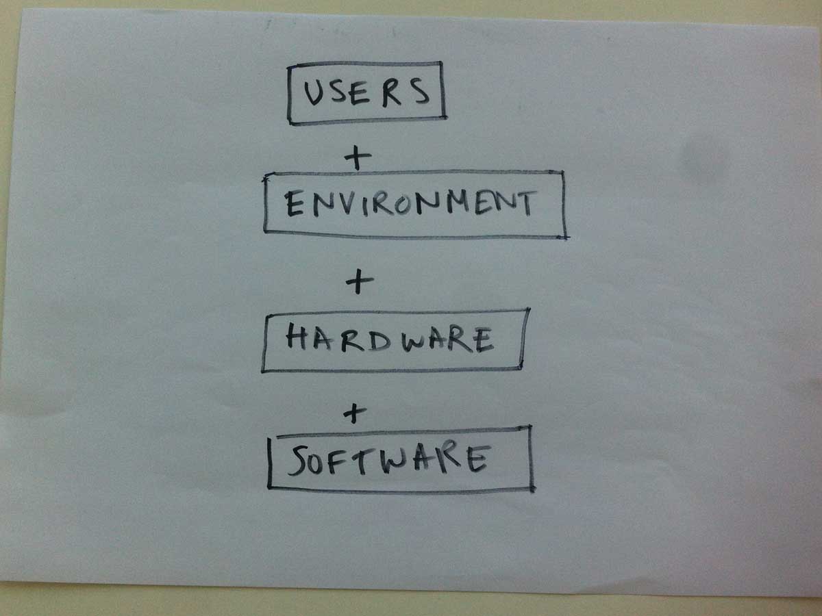
The digital visitor experience means we are in the rare position of being in control of more than one element. Think of what Apple could do because they designed the hardware and the software. Let’s not miss the opportunities provided by being able to develop software in a particular place. We do have to answer - “Will kids have phones?”
+++
2
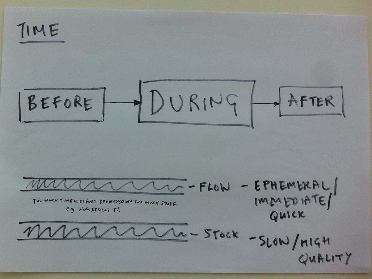
We are creating an experience across time and space. Most of it will focus on the event but we must consider before and after as well. It’s easy to forget, but we need to stick to strict definitions of the type of content and the purpose:
- Lots of ephemeral, immediate and quick to produce - real-time / flow
- Less high-quality and lasting - highlights / stock
+++
3
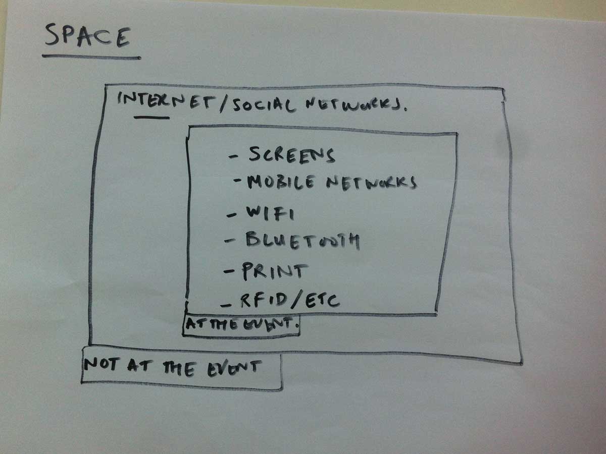
Space is mainly about the event, but we need to consider how to create a compelling experience for people who aren’t at the event.
+++
4
Principles
- Create a collective experience across space and time
- Don’t repeat ourselves
- Prioritize reach / accessibility
- Work with and enhance existing behaviours
- No separate digital world
- Create wonder
+++
5
User-centred approach
- Who will be using these products?
- What do they want to do (and what do we want to encourage them to do)?
- How can we help them do that?
Personas and user stories eg as a [type of user] I want [something] so that I can [benefit]
+++
6
Who are our users?
- Young people (see next slide)
- Parents / family
- Teachers
- Competitors
- Journalists
- Partners / sponsors
- Volunteers
- “Delegates”
+++
7
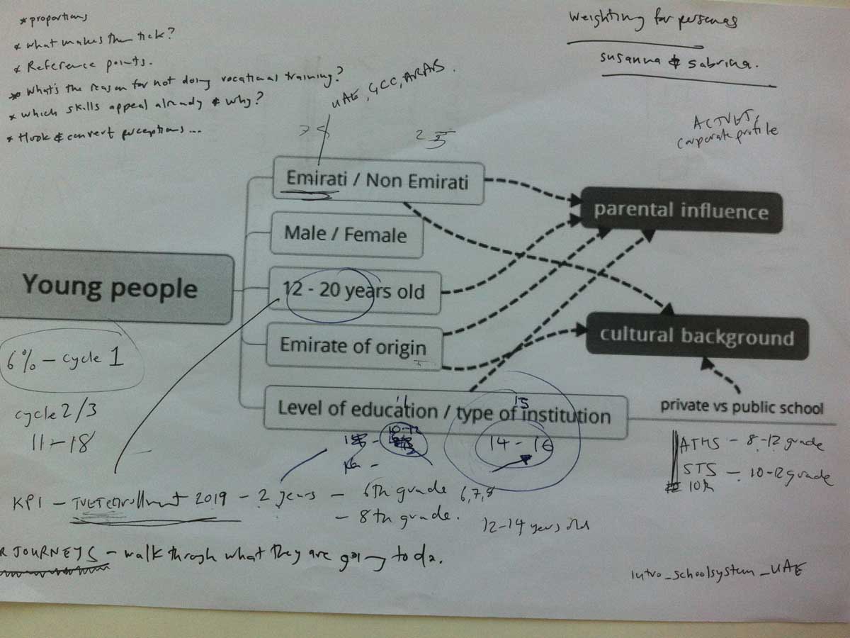
Remember the KPI about TVET enrollment for 2019 and work backwards. Focus on Emiratis who are:
- 12-14 years old / Grades 6-8
- 16-18 years old / Grades 10-12
Lots of other factors, but for now let’s concentrate on a 12 year old and a 16 year old. What are their reference points? What makes them tick?
+++
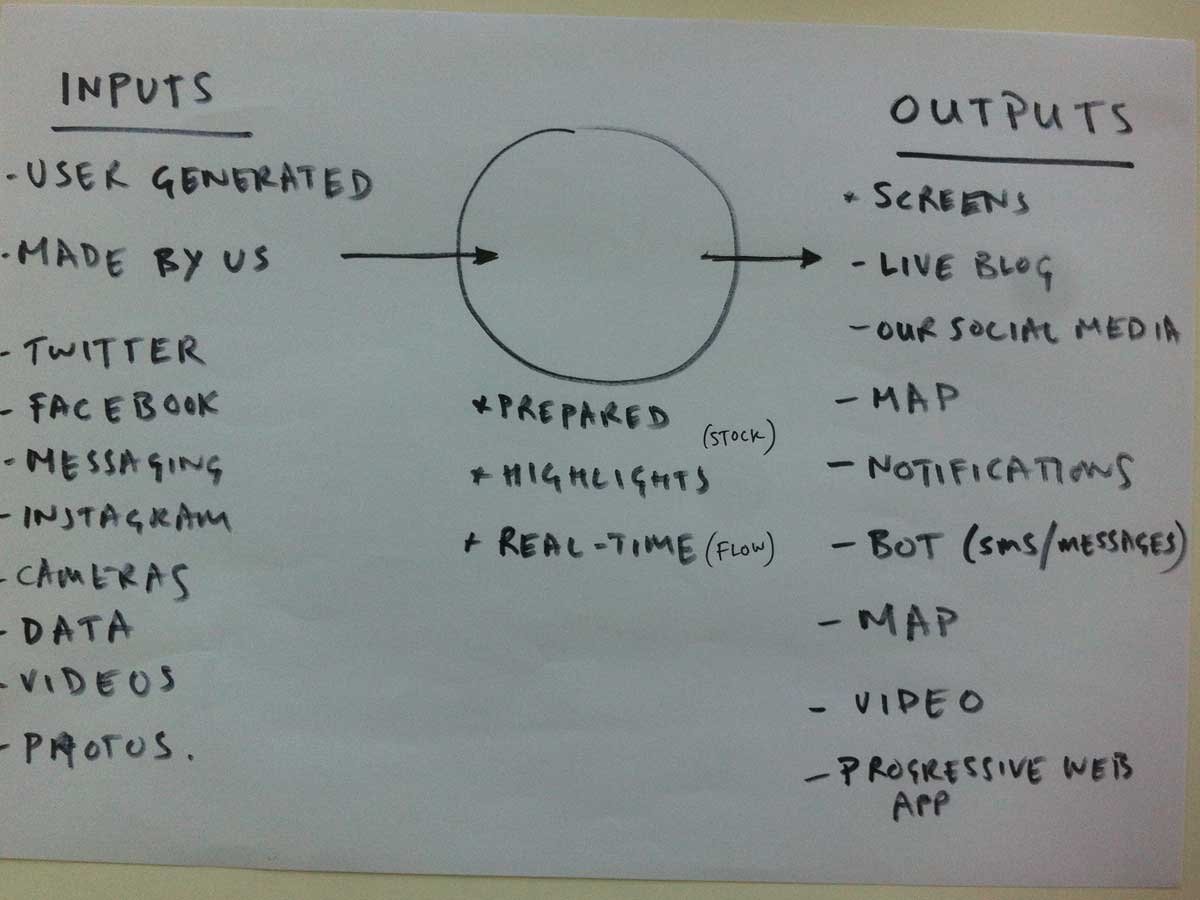
8
To avoid repeating ourselves, we could frame lots of the digital experience as a set of inputs and outputs. We take inputs generated by us and by users, we process them (quick and emphemeral or longer-lasting) and we publish them to various places.
+++
9
The backbone could be a “progressive web app”. The browser technology to support “progressive web apps” is here. They are:
- responsive, i.e. adapt to different devices
- connectivity independent (i.e. work offline)
- have app-like-interactions,
- have notifications (fresh and up-to-date)
- discoverable
- installable
- linkable
- Lasting legacy (easy to archive and re-use)
So basically taking the best of the web and the best of apps and trying to bring them together. So things like offline reading and push notifications will become part of the web. These things are only possible because we have reached a point where browser technologies are catching up with the things native apps have had for years. And the “progressive” part means that if you don’t have such a browser things still work, but if you do have a modern browser you get the super-charged experience.
+++
10
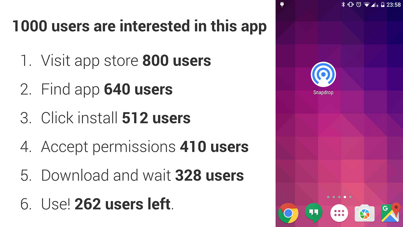
Native apps are expensive to make, hard to keep up to date and require different technologies for different platforms. The way people get apps initially seems like a good approach, but data shows it doesn’t really work in most situations. See above for the way people drop off from 1,000 interested users to about a quarter who actually open your app. Figures are from an article by Remy Sharp. We could have short urls or even Emoji domain names
+++
11
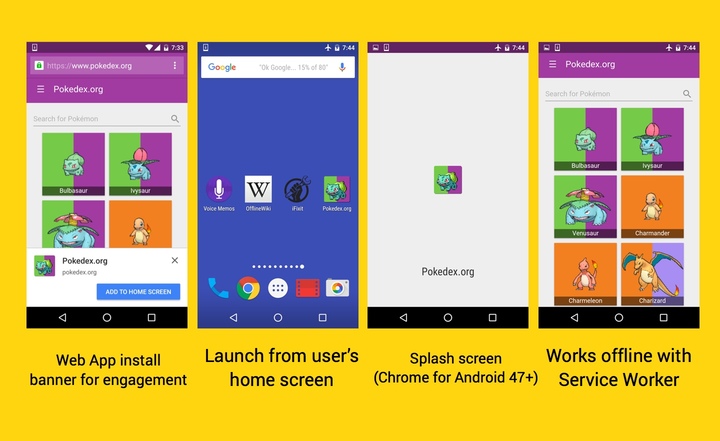
Here’s a few details about how progressive web apps work from a user’s perspective. More details in the article where the image comes by Addy Osmani.
+++
12
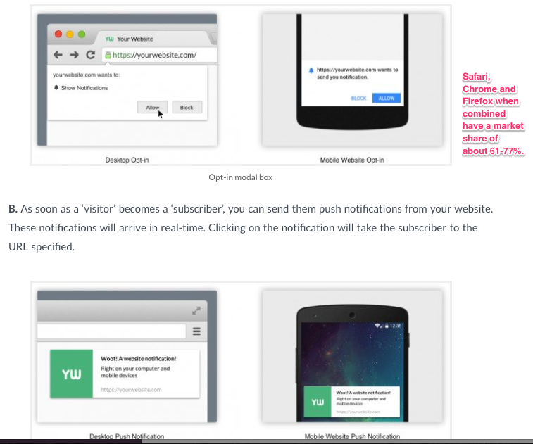
And here’s how push notifications work along with some examples of progressive web apps:
- This is a really simple (and pointless) chat app but if you look on your phone it might give you a sense of the potential for an “app-like” experience.
- Google did this one for one of their events. Take a look at schedule.
- This one from the Guardian gives you some idea of the complex map things which are possible. (You have to go to it on your phone.)
- Take a look at the FT App not necessarily for the design/layout but because of the app-like toolbar at the bottom.
+++
13
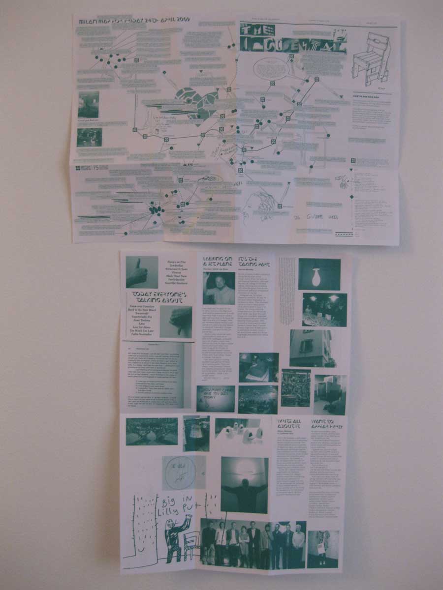
What happens if you try to imbue paper with the affordances of the web? One of the outputs could be a daily social map printed overnight on the competition presses incorporating the highlights from social media on the previous day. The map would evolve over the event and act as service and souvenir. It could include messages, sponsorship and content. Here’s an example from the Salone del Mobile in Milan 2009 by BERG
+++
14
A live blog aggregates news and content from Twitter, Instagram, Facebook, etc. into a single place.
- Summaries and updates
- Video, text, image, post from social media
- Edit and curate
- Colloquial, unfinished tone
- Pick out key events / highlights
- Would also power screens around the event
+++
15
Lots of fun to be had here:
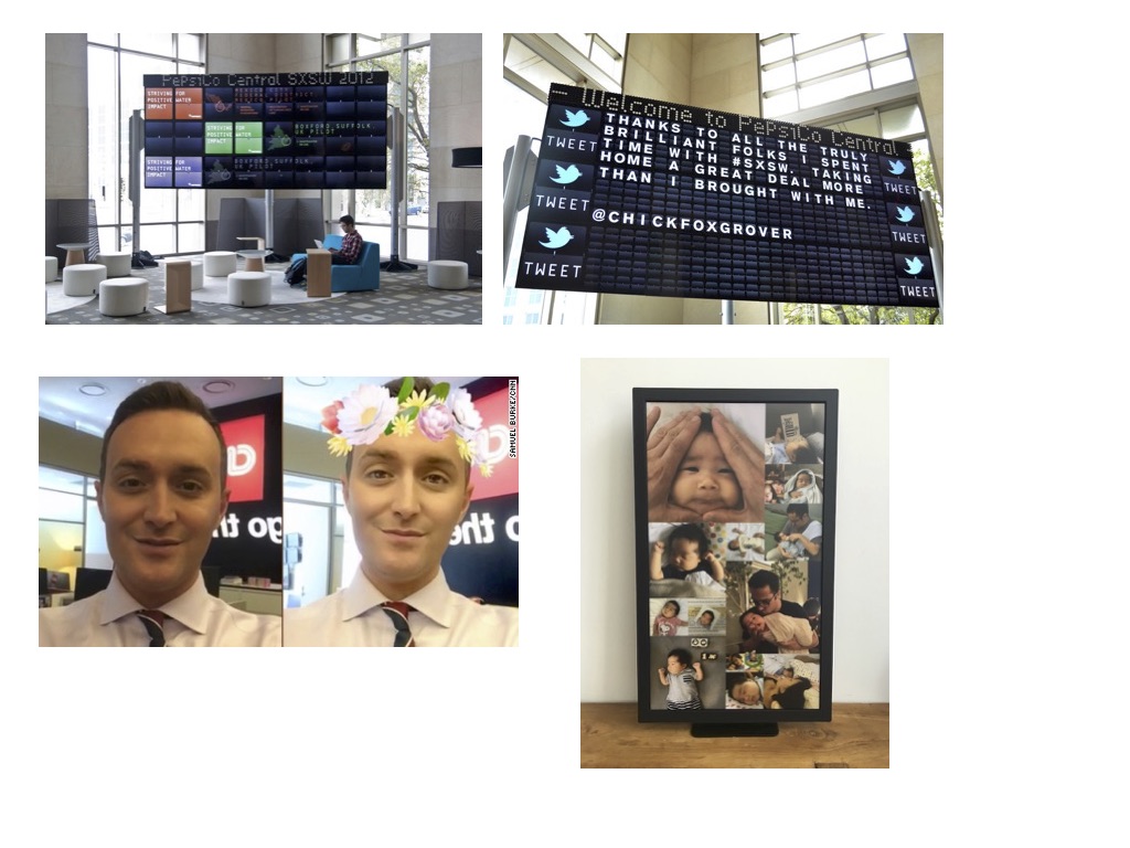
- Big screens around the event could display data, highlights from the live blog, etc. Here’s a good example of a big screen
- Cameras and screens around the event could take photos of people attach relevant skills props (like Snapchat filters) and then show those images on screens around the event. It has potential to bring people into the event and make them part of it.
+++
16
A digital / physical game to:
- encourage young people to explore different skills
- be part of a memorable collective experience
- have fun
- collect data
By EmiratesSkills in April 2017 we’ll have something which can be tested live, focusing on creating a positive experience for participants, trying out the core interaction concepts, and having a clear roadmap of how this could scale.
+++
17
How to use 360 video and 3d rendering with the help of Autodesk.
- Browser technology is starting to catch up
- 3d scans of areas and objects
- 360 videos for tours and daily highlights
- 3d printing of test objects
+++
18
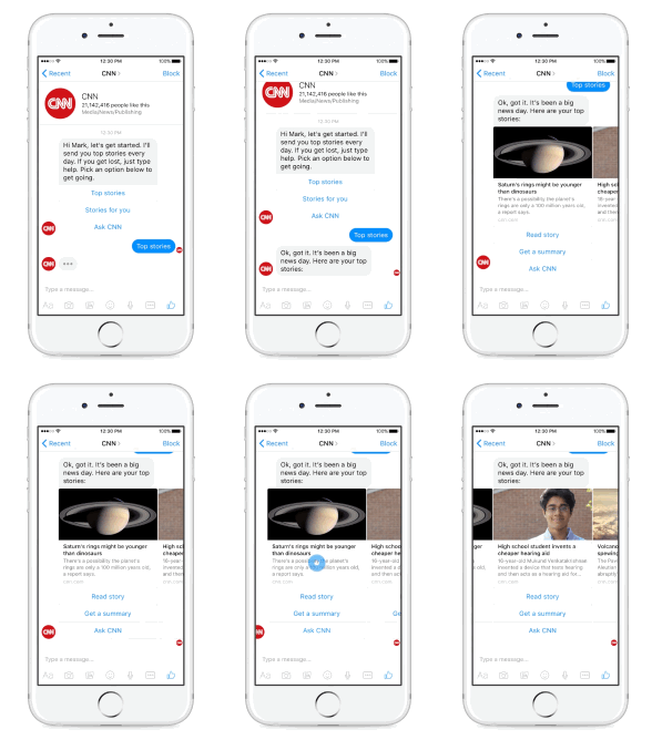
A bot to respond to questions on SMS, Messenger, etc. See the CNN one for a quick example or read about the Quartz bot here
“Hi, I’m your guide. I can give advice, help you find what to do and where to go.”
- Instantly interact with the event
- Predefined options / suggested responses
- Needs a lot of work on onboarding, how to use and purpose.
+++
Thanks for making it to the end! Lots of work to be done. If you have any ideas or questions please email robert.carroll@worldskillsabudhabi2017.com
