


Top 10 hotels in Abu Dhabi
Lorem ipsum dolor sit amet, consectetur adipisicing elit, sed do eiusmod tempor incididunt ut labore et dolore magna aliqua.
Welcome to the style guide for the WorldSkills Abu Dhabi 2017 website. This page lists all the components built for the site, and shows examples of their use.
Further documentation for the WSI Concrete5 team is provided in comments in the source code.
Body copy styles are styles for HTML headings, paragraphs and lists.
When used in grid columns 9 units or narrower, or on screens narrower than the Bootstrap grid’s medium breakpoint (992px), body copy paragraphs and lists will fill all available width.
When used in grid columns ten units or wider, or outside of grid columns on screens 992 pixels wide or wider, body copy paragraphs and lists will fill no more than 75% of the available width, to keep line lengths readable.
This is a body copy paragraph. Lorem ipsum dolor sit amet, consectetur adipiscing elit. Ut molestie tortor ac quam feugiat interdum. Aenean lacus quam, pharetra in tincidunt tempor, egestas at tortor. Integer bibendum sapien vel magna sagittis, et ultrices libero tincidunt. Pellentesque suscipit mi sed odio suscipit, sed imperdiet metus sollicitudin. Ut a nisl ut elit lacinia facilisis. Morbi eu semper dui. Aliquam nec libero consequat, volutpat dolor vitae, imperdiet justo. Nulla posuere feugiat ligula.
This is another body copy paragraph with a link in it, and another link that you probably haven’t visited. Lorem ipsum dolor sit amet, consectetur adipiscing elit. Ut molestie tortor ac quam feugiat interdum. Aenean lacus quam, pharetra in tincidunt tempor, egestas at tortor. Integer bibendum sapien vel magna sagittis, et ultrices libero tincidunt. Pellentesque suscipit mi sed odio suscipit, sed imperdiet metus sollicitudin. Ut a nisl ut elit lacinia facilisis. Morbi eu semper dui. Aliquam nec libero consequat, volutpat dolor vitae, imperdiet justo. Nulla posuere feugiat ligula.
This is another body copy paragraph. Lorem ipsum dolor sit amet, consectetur adipiscing elit. Ut molestie tortor ac quam feugiat interdum. Aenean lacus quam, pharetra in tincidunt tempor, egestas at tortor. Integer bibendum sapien vel magna sagittis, et ultrices libero tincidunt. Pellentesque suscipit mi sed odio suscipit, sed imperdiet metus sollicitudin. Ut a nisl ut elit lacinia facilisis. Morbi eu semper dui. Aliquam nec libero consequat, volutpat dolor vitae, imperdiet justo. Nulla posuere feugiat ligula.
Lorem ipsum dolor sit amet, consectetur adipiscing elit. Ut molestie tortor ac quam feugiat interdum. Aenean lacus quam, pharetra in tincidunt tempor, egestas at tortor. Integer bibendum sapien vel magna sagittis, et ultrices libero tincidunt. Pellentesque suscipit mi sed odio suscipit, sed imperdiet metus sollicitudin. Ut a nisl ut elit lacinia facilisis. Morbi eu semper dui. Aliquam nec libero consequat, volutpat dolor vitae, imperdiet justo. Nulla posuere feugiat ligula.
This is body copy. Lorem ipsum dolor sit amet, consectetur adipiscing elit. Ut molestie tortor ac quam feugiat interdum. Aenean lacus quam, pharetra in tincidunt tempor, egestas at tortor. Integer bibendum sapien vel magna sagittis, et ultrices libero tincidunt. Pellentesque suscipit mi sed odio suscipit, sed imperdiet metus sollicitudin. Ut a nisl ut elit lacinia facilisis. Morbi eu semper dui. Aliquam nec libero consequat, volutpat dolor vitae, imperdiet justo. Nulla posuere feugiat ligula.
This is body copy. Lorem ipsum dolor sit amet, consectetur adipiscing elit. Ut molestie tortor ac quam feugiat interdum. Aenean lacus quam, pharetra in tincidunt tempor, egestas at tortor. Integer bibendum sapien vel magna sagittis, et ultrices libero tincidunt. Pellentesque suscipit mi sed odio suscipit, sed imperdiet metus sollicitudin. Ut a nisl ut elit lacinia facilisis. Morbi eu semper dui. Aliquam nec libero consequat, volutpat dolor vitae, imperdiet justo. Nulla posuere feugiat ligula.
Lorem ipsum dolor sit amet, consectetur adipiscing elit. Ut molestie tortor ac quam feugiat interdum. Aenean lacus quam, pharetra in tincidunt tempor, egestas at tortor. Integer bibendum sapien vel magna sagittis, et ultrices libero tincidunt. Pellentesque suscipit mi sed odio suscipit, sed imperdiet metus sollicitudin. Ut a nisl ut elit lacinia facilisis. Morbi eu semper dui. Aliquam nec libero consequat, volutpat dolor vitae, imperdiet justo. Nulla posuere feugiat ligula.
Lorem ipsum dolor sit amet, consectetur adipiscing elit. Ut molestie tortor ac quam feugiat interdum. Aenean lacus quam, pharetra in tincidunt tempor, egestas at tortor. Integer bibendum sapien vel magna sagittis, et ultrices libero tincidunt. Pellentesque suscipit mi sed odio suscipit, sed imperdiet metus sollicitudin. Ut a nisl ut elit lacinia facilisis. Morbi eu semper dui. Aliquam nec libero consequat, volutpat dolor vitae, imperdiet justo. Nulla posuere feugiat ligula.
The Large Intro component creates large text in a lighter-weight font. It is intended to be used for introductions.
This is introductory text. Lorem ipsum dolor sit amet, consectetur adipiscing elit. Ut molestie tortor ac quam feugiat interdum. Aenean lacus quam, pharetra in tincidunt tempor, egestas at tortor.
When used in grid columns 9 units or narrower, or on screens narrower than the Bootstrap grid’s medium breakpoint (992px), the Large Intro will fill all available width.
When used in grid columns ten units or wider, or outside of grid columns on screens 992 pixels wide or wider, the Large Intro will fill no more than 75% of the available width, to keep line lengths readable.
Button variation (white border, intended for use on darker backgrounds. Currently used on the second scroll story.)
Button variation (for use on photo backgrounds: see the Link block component below)
The divider creates a dividing line with space above and below it.
The line takes up the entire width of its containing element.
If at the end of a module, it’s ragged or not as distinct, use a grey line below. If the bottom of a module has a clear end, e.g. the bottom of a link block, then it doesn’t have a line below it.
The Boxout component adds a background highlight around text content.
100 words or so about this skill. Lorem ipsum dolor sit amet, consectetur adipiscing elit. Ut molestie tortor ac quam feugiat interdum. Aenean lacus quam, pharetra in tincidunt tempor, egestas at tortor. Integer bibendum sapien vel magna sagittis, et ultrices libero tincidunt.
Pellentesque suscipit mi sed odio suscipit, sed imperdiet metus sollicitudin. Ut a nisl ut elit lacinia facilisis. Morbi eu semper dui. Aliquam nec libero consequat, volutpat dolor vitae, imperdiet justo.
The angled heading can be used as a section for page layout sections.
It is also used as the heading within the Link block component (see below).
The bottom border can have different colours. Each one matches a different section of the site. The default is red.
Only one line of text can fit inside the angled header. Longer text will be automatically truncated.
The layout grid for the site is the Bootstrap grid with twelve columns.
The grid has twelve cols. (These example columns stop being columns at small and extra small breakpoints: see the Bootstrap Grid documentation for details.)
The grid has twelve cols.
The grid has twelve cols.
The grid has twelve cols.
The grid has twelve cols.
The grid has twelve cols.
The grid has twelve cols.
The grid has twelve cols.
The grid has twelve cols.
The grid has twelve cols.
The grid has twelve cols.
The grid has twelve cols.
When lists should be laid out in alignment with the grid, the grid classes can be assigned to list tags. However, the list element must also have a grid-list class assigned to it, so that the list is laid out correctly on right-to-left pages.
List item 1
List item 2
List item 3
List item 4
List item 5
List item 6
List item 7
List item 8
List item 9
List item 10
List item 11
List item 12
List item 1
List item 2
List item 3
List item 4
The Link Block is a component for adding a link to other pages. The entire element is clickable.
It is designed to have a photographic background (except for the “Competitors” and “Countries” variations — see below).
The photo will be scaled to fill the entire background, even if this changes the aspect ratio of the photo. The photo will also have a semi-transparent dark gradient applied to it, to help the readability of the text on top of it.
By default, the Link Block is square. This default square Link Block is intended to be used within columns that are three units wide, and columns that are six units wide.
There is a double-height Link Block that is the same height as a default Link Block is when used in a column that’s six units wide.
There is also a wide Link Block, intended to be used in columns that are six units wide.
And a very wide Link Block, intended to be used in columns that are twelve units wide.
The Link Block can also contain an optional bottom-aligned button element. The entire Link Block will still be clickable, but for larger link blocks, this faux-button may make the clickability more obvious.
Both the wide Link Block and the Very Wide Link Block will become square on screens narrower than 768 pixels.
The Link Block uses the Angled Heading component for its heading. This component truncates text longer than one line, so headings should be kept short: around 17 characters (for narrow mobile phone screens), and around 15 characters if used within a column that’s three units wide.
It has two other variations intended to link to specific page types: “Competitors” (to link to Competitor pages), and “Countries” (to link to Country pages). These variations have background and heading-border colours matching the sections that those page types appear in.
These variations are only intended to be used within columns that are three units wide.
Their images do not cover the entire background:
The Competitor Link is a component for linking to competitor pages, or simply displaying a photo of a competitor and summary of information about them.
It is intended to be used within a column that’s two units wide at medium and large breakpoints, three units wide at the small breakpoint, and four units wide at the extra-small breakpoint.
If present, the competitor’s country name and the skill in which they’re competing link to the pages for that country and skill.
When used for a competitor in this year’s competition, the photo and competitor name link to that competitor’s page.
When used for a competitor in a past competition, the photo and competitor name do not link anywhere. However, an additional section is included when that competitor won a medal.


Won gold in Bakery
The Skill Link is a component for linking to skill pages. The entire component is clickable.
It is intended to only be used within a column that’s three units wide.
Underneath the photo, the skill name is displayed, and optionally the skill sector.
The area that contains the skill name and sector has been given a fixed height, to ensure that when the Skill Link is used in a list of skills that wraps onto two or more grid rows, the grid system continues to work.
The Country landing page list is the list of countries on the Country landing page.
After every fourth country to be displayed, a new <ul> element must be started.
The Logo List is a horizontal list of logos, for example sponsor logos, with a heading.
Note that the site footer contains a logo list of organisations involved with WorldSkills Abu Dhabi 2017 (although its heading is only visible to screen readers).
No dimensions for the logo images or their containing elements are defined in the CSS, so unless the inherent dimensions of the image file match the desired dsplay dimensions (across all screen sizes and resolutions), width and/or height must be specified on the <img> tag for each logo.
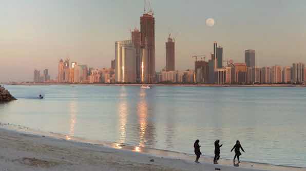
The captioned image is an image with an associated caption (which can include a copyright statement).
The external link is a link to a page on another website. It includes an icon after the link text indicating that the link leads to another website.
The flag image is a stylised version of a country flag. It is currently only used on the individual Country page.
It takes up whatever horizontal space is availabe, so it must be used within a grid column.

The News Story Summary is a link to a news story, with a description of that story and an image, if available. The divider component should be used between News Story Summaries.
Article summaries are used in the news landing below the title and above the date, the news article page below the date and in Google search results below the link. Try to make them:
It is currently used on the news homepage.
Lorem ipsum dolor sit amet, consectetur adipisicing elit, sed do eiusmod tempor incididunt ut labore et dolore magna aliqua.
Lorem ipsum dolor sit amet, consectetur adipisicing elit, sed do eiusmod tempor incididunt ut labore et dolore magna aliqua.
The Newsletter Signup is a form allowing users to register their e-mail address to receive the site's newsletter.
The Skill Sponsor is a sponsor logo intended for use on the Skill page.
The Social Link is a link to a social media or website page.
It is currently used on the Country page to link to the website and/or social media pages for that country’s WorldSkills team.
It can be used in a list:
Or individually:
The YouTube embed is used to include videos from YouTube on the current page.
The Timeline allows events to be listed in date order, grouped by month.
This is an event that is happening.
This is an another event that is also happening.
One School One Country is a programme designed for cultural exchange between students on the host country and Member countries/regions. Several Abu Dhabi schools will have the opportunity to welcome a WorldSkills Member country or region for a unique visitor exchange that lets students and Competitors learn more about each other’s culture, traditions, and values. School students will also get a chance to discover more about the skilled careers represented at WorldSkills Abu Dhabi 2017.

WorldSkills Abu Dhabi 2017 will begin with a spectacular Opening Ceremony that will gather thousands of Competitors, officials, and guests together to watch the Parade of Nations and a welcome to Abu Dhabi and the United Arab Emirates. As more details are revealed, they will be announced here — so keep coming back!
Over four days, hundreds of young competitors from around 65 Countries and Regions will give their all to win glory in the 51 Skills of WorldSkills Abu Dhabi 2017.
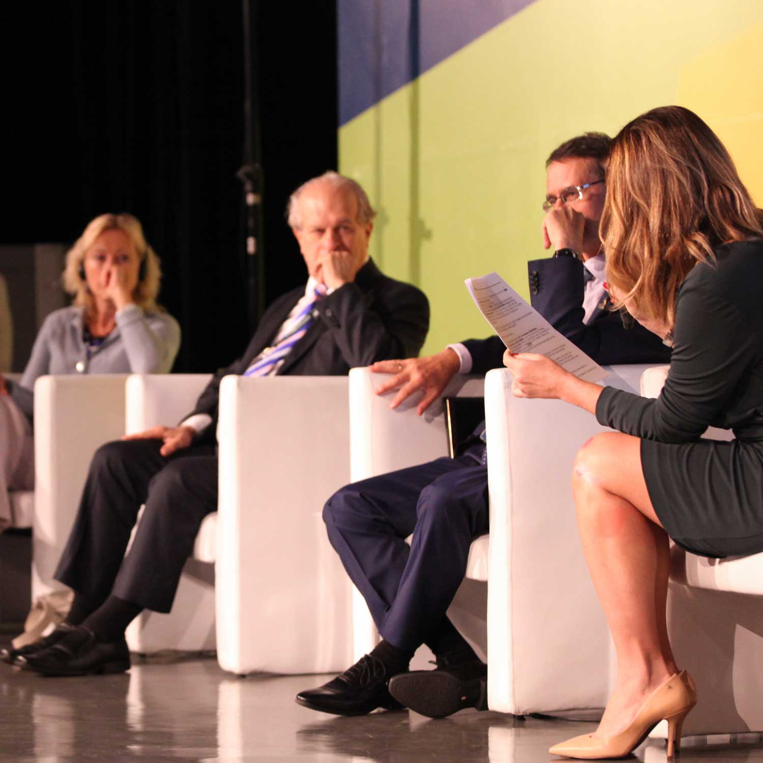
The WorldSkills Conference Programme brings together leaders from around the world for a productive, informative, and eye-opening programme with the 44th WorldSkills Competition as its centrepiece. It is an unparalleled opportunity to meet and network with the leaders and policy makers of today, as well as to address current and future global skills challenges.

Who will be the skills Medallists of WorldSkills Abu Dhabi 2017? The Closing Ceremony will reveal the winners of gold, silver, and bronze medals, along with Medallions for Excellence, and the coveted Albert Vidal Award for the Competitor with the highest overall points. The Closing Ceremony is a time celebrate and to say farewell to old and new friends of the 44th WorldSkills Competition, while looking forward to Russia and WorldSkills Kazan 2019.
The Sponsorship Banner displays adverts from sponsors.
Each advert must have two images: the background image, which appears underneath a translucent blue layer for readability; and the sponsor logo image, whic appears on a white background, and has “Sponsored By” overlaid on top of it.
Social Link